# Header Glass

> Floating header with the links in a frosted-glass pill, made to sit over a full-bleed hero image. No JavaScript.

- **Slug:** `header-glass`
- **Kind:** section · **Category:** Site chrome
- **Source:** original to Viewership UI
- **Docs page:** https://viewership.ai/design/components/header-glass
- **All files in one bundle:** https://viewership.ai/design/components/header-glass.bundle.txt
- **Structured JSON:** https://viewership.ai/design/components/header-glass.json

## Install

1. Import the foundation tokens once (download: https://viewership.ai/design/raw/foundation.css.txt):

```astro
---
// src/layouts/Layout.astro
import "../styles/foundation.css";
---
```

2. Copy this file into `src/components/viewership/header-glass/`:

   - `HeaderGlass.astro` (raw: https://viewership.ai/design/raw/header-glass/HeaderGlass.astro.txt)

npm packages: none.

## Usage

```astro
---
import HeaderGlass from "../components/viewership/header-glass/HeaderGlass.astro";
---

<HeaderGlass />
```

## Example

The gallery demo, verbatim. Use the import path from Usage instead of `./`.

```astro
---
import HeaderGlass from "./HeaderGlass.astro";

interface Props {
  variant?: string;
}
const { variant = "Dark media" } = Astro.props;
const dark = variant === "Dark media";
---

<div class="demo">
  <HeaderGlass
    overlay
    tone={dark ? "inverse" : "default"}
    brand="Northwind"
    current="#trips"
    links={[
      { label: "Trips", href: "#trips" },
      { label: "Gear", href: "#gear" },
      { label: "Repairs", href: "#repairs" },
      { label: "Journal", href: "#journal" },
    ]}
    secondary={{ label: "Log in", href: "#" }}
    cta={{ label: "Plan a trip", href: "#" }}
  />
  {
    dark ? (
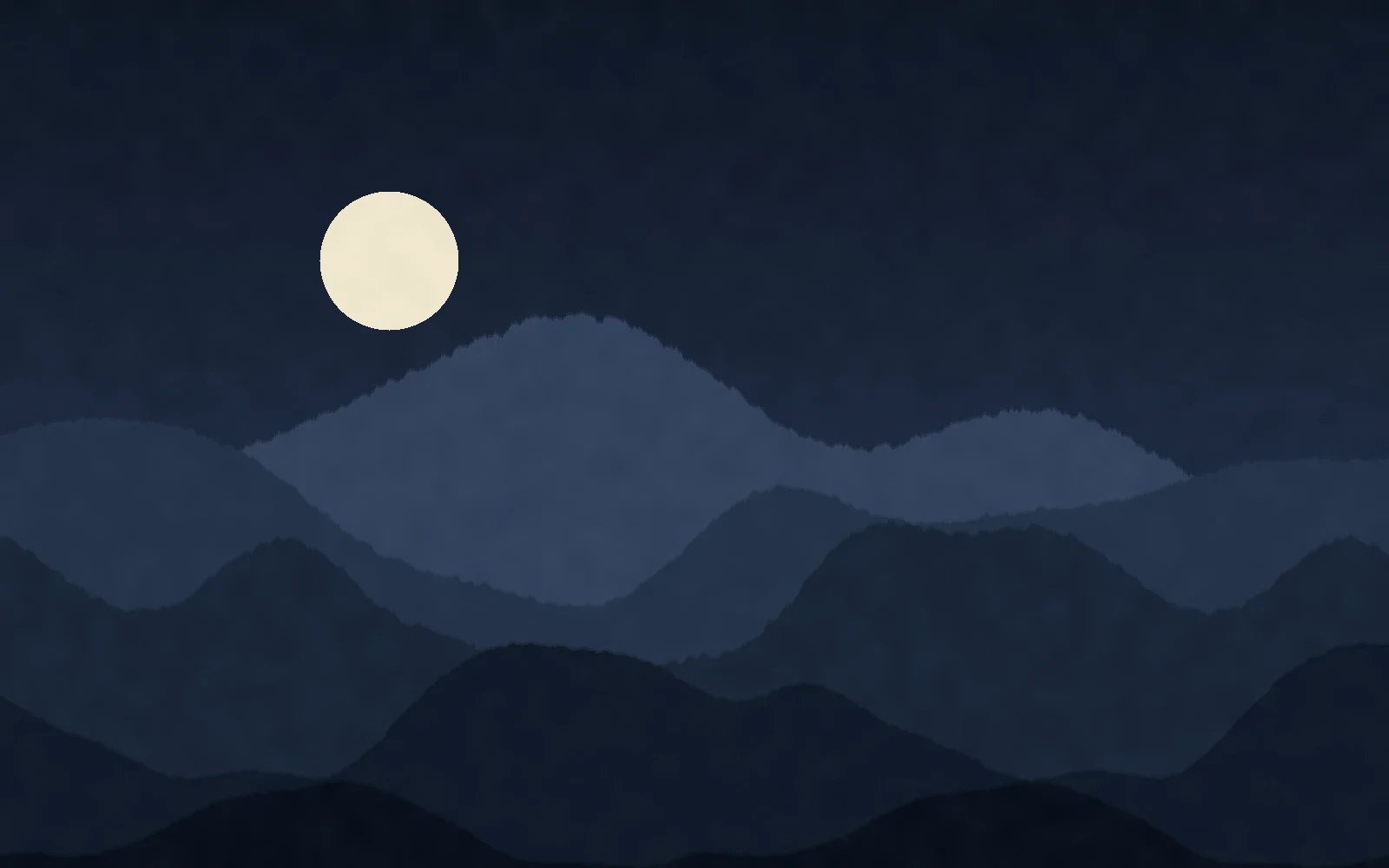
      <img src="/ui/demo/ridgeline-night.webp" alt="Mountain ridges under a full moon" width="1600" height="1000" loading="lazy" />
    ) : (
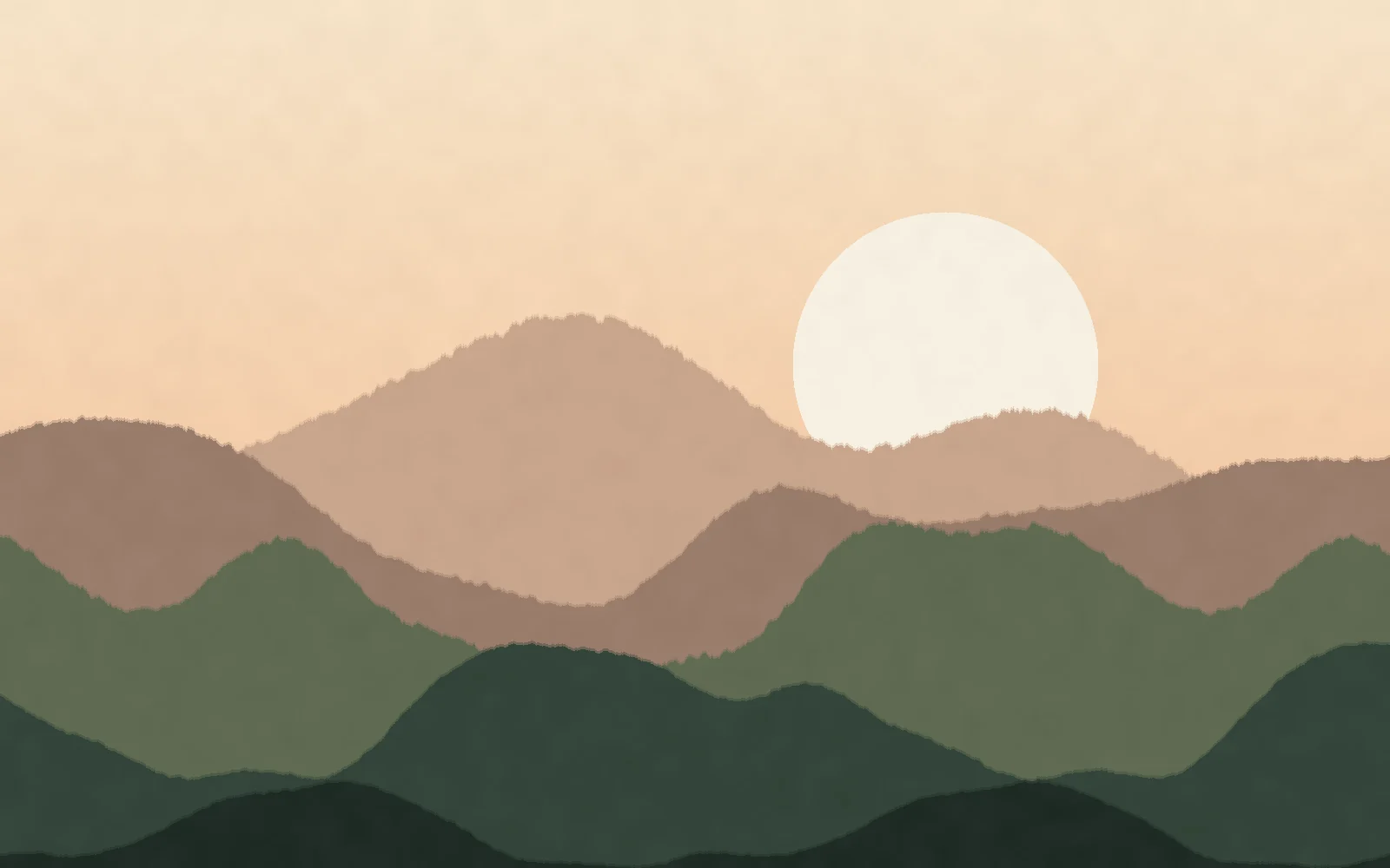
      <img src="/ui/demo/ridgeline.webp" alt="Layered mountain ridges at dusk" width="1600" height="1000" loading="lazy" />
    )
  }
</div>

<style>
  .demo {
    position: relative;
    overflow: hidden;
    border-radius: var(--vs-radius-window);
  }
  .demo img {
    display: block;
    width: 100%;
    height: 380px;
    object-fit: cover;
  }
</style>
```

## Variants

Demo variants: `Dark media`, `Light media`.

## Props

| Prop | Type | Default | Description |
| --- | --- | --- | --- |
| `brand` | `string` |  | Brand name, set as text unless the logo slot is used. |
| `brandHref` | `string` | `"/"` | Where the brand links. |
| `links` | `{ label: string; href: string }[]` |  | Links inside the glass pill. |
| `secondary` | `{ label: string; href: string }` |  | Quiet text link before the CTA, such as Log in. |
| `cta` | `{ label: string; href: string }` |  | Solid button on the right. |
| `current` | `string` |  | Href of the current page (sets aria-current). |
| `overlay` | `boolean` | `false` | Position absolutely over the top of the parent, for use over a hero image. |
| `tone` | `"default" \| "inverse"` | `"default"` | Use inverse for light text and white glass over dark media. |
| `slot: logo` | `slot` |  | Replaces the text brand. |

## Source

### `src/components/viewership/header-glass/HeaderGlass.astro`

```astro
---
/**
 * HeaderGlass: a floating header for pages that open on a full-bleed image.
 * The links sit in a frosted-glass pill in the middle; brand on the left,
 * a quiet link and a call to action on the right. On narrow widths the links
 * fold into a frosted native <details> sheet, so it needs no JavaScript.
 *
 * Put it inside the hero (or any positioned wrapper) with `overlay` to lay it
 * over the media. Use `tone="inverse"` when the media behind it is dark.
 *
 * @example
 * <div style="position: relative">
 *   <HeaderGlass overlay tone="inverse" brand="Northwind" links={links} cta={{ label: "Start a trip", href: "/trips" }} />
 *   <img src="/hero.webp" alt="" />
 * </div>
 */

interface NavLink {
  label: string;
  href: string;
}
interface Props {
  brand: string;
  brandHref?: string;
  links: NavLink[];
  /** Quiet text link before the CTA, e.g. "Log in". */
  secondary?: NavLink;
  cta?: NavLink;
  /** Href of the current page (sets aria-current). */
  current?: string;
  /** Lay the header over whatever follows it (absolute, top of the parent). */
  overlay?: boolean;
  /** "inverse" sets light text and a white glass for dark media. */
  tone?: "default" | "inverse";
  class?: string;
}

const {
  brand,
  brandHref = "/",
  links,
  secondary,
  cta,
  current,
  overlay = false,
  tone = "default",
  class: className,
} = Astro.props;
---

<header class:list={["vs-header-glass", `is-${tone}`, { "is-overlay": overlay }, className]}>
  <div class="vs-header-glass__inner">
    <a class="vs-header-glass__brand" href={brandHref}>
      <slot name="logo">{brand}</slot>
    </a>

    <nav class="vs-header-glass__pill" aria-label="Main">
      <ul>
        {
          links.map((l) => (
            <li>
              <a href={l.href} aria-current={l.href === current ? "page" : undefined}>
                {l.label}
              </a>
            </li>
          ))
        }
      </ul>
    </nav>

    <div class="vs-header-glass__end">
      {secondary && <a class="vs-header-glass__quiet" href={secondary.href}>{secondary.label}</a>}
      {cta && <a class="vs-header-glass__cta" href={cta.href}>{cta.label}</a>}
    </div>

    <details class="vs-header-glass__menu">
      <summary aria-label="Menu">
        <span class="vs-header-glass__burger" aria-hidden="true"><i></i><i></i></span>
      </summary>
      <nav class="vs-header-glass__sheet" aria-label="Main">
        <ul>
          {
            links.map((l) => (
              <li>
                <a href={l.href} aria-current={l.href === current ? "page" : undefined}>
                  {l.label}
                </a>
              </li>
            ))
          }
        </ul>
        {
          (secondary || cta) && (
            <div class="vs-header-glass__sheet-end">
              {secondary && <a class="vs-header-glass__quiet" href={secondary.href}>{secondary.label}</a>}
              {cta && <a class="vs-header-glass__cta" href={cta.href}>{cta.label}</a>}
            </div>
          )
        }
      </nav>
    </details>
  </div>
</header>

<style>
  .vs-header-glass {
    /* Glass recipe. Inverse swaps to light text over dark media. */
    --glass-ink: var(--vs-ink);
    --glass-ink-2: var(--vs-ink-2);
    --glass-fill: color-mix(in srgb, var(--vs-surface) 55%, transparent);
    --glass-fill-hover: color-mix(in srgb, var(--vs-surface) 80%, transparent);
    --glass-edge: color-mix(in srgb, var(--vs-surface) 70%, transparent);
    --glass-cta-bg: var(--vs-ink);
    --glass-cta-ink: var(--vs-ink-inverse);

    container-type: inline-size;
    position: relative;
    z-index: 10;
    color: var(--glass-ink);
    font-family: var(--vs-font-sans);
    font-stretch: var(--vs-font-stretch);
  }
  .vs-header-glass.is-inverse {
    --glass-ink: #fff;
    --glass-ink-2: rgb(255 255 255 / 0.82);
    --glass-fill: rgb(255 255 255 / 0.14);
    --glass-fill-hover: rgb(255 255 255 / 0.24);
    --glass-edge: rgb(255 255 255 / 0.22);
    --glass-cta-bg: var(--vs-surface);
    --glass-cta-ink: var(--vs-ink);
  }
  .vs-header-glass.is-overlay {
    position: absolute;
    inset: 0 0 auto;
  }
  .vs-header-glass__inner {
    display: flex;
    min-height: 76px;
    align-items: center;
    justify-content: space-between;
    gap: 20px;
    max-width: var(--vs-container);
    margin-inline: auto;
    padding: 0 var(--vs-gutter);
  }
  .vs-header-glass a {
    color: inherit;
    text-decoration: none;
  }
  .vs-header-glass a:focus-visible,
  .vs-header-glass summary:focus-visible {
    outline: none;
    box-shadow: var(--vs-focus-ring);
  }
  .vs-header-glass ul {
    margin: 0;
    padding: 0;
    list-style: none;
  }
  .vs-header-glass__brand {
    font-family: var(--vs-font-display, var(--vs-font-sans));
    font-size: 1.375rem;
    font-weight: var(--vs-display-weight);
    letter-spacing: var(--vs-display-tracking);
    text-transform: var(--vs-display-transform);
  }

  /* The frosted surface, shared by the pill, the menu button and the sheet. */
  .vs-header-glass__pill,
  .vs-header-glass__menu summary,
  .vs-header-glass__sheet {
    background: var(--glass-fill);
    border: 1px solid var(--glass-edge);
    -webkit-backdrop-filter: blur(18px) saturate(1.4);
    backdrop-filter: blur(18px) saturate(1.4);
    box-shadow: 0 1px 0 rgb(255 255 255 / 0.12) inset, var(--vs-shadow-md);
  }

  .vs-header-glass__pill {
    display: none;
    padding: 5px;
    border-radius: var(--vs-radius-pill);
  }
  .vs-header-glass__pill ul {
    display: flex;
    gap: 2px;
  }
  .vs-header-glass__pill a {
    display: block;
    padding: 9px 16px;
    border-radius: var(--vs-radius-pill);
    font-size: 0.9375rem;
    color: var(--glass-ink-2);
    transition:
      color var(--vs-duration-fast) ease-out,
      background-color var(--vs-duration-fast) ease-out;
  }
  .vs-header-glass__pill a:hover,
  .vs-header-glass__pill a[aria-current="page"] {
    color: var(--glass-ink);
    background: var(--glass-fill-hover);
  }

  .vs-header-glass__end {
    display: none;
    align-items: center;
    gap: 20px;
  }
  .vs-header-glass__quiet {
    font-size: 0.9375rem;
    color: var(--glass-ink-2);
    transition: color var(--vs-duration-fast) ease-out;
  }
  .vs-header-glass__quiet:hover {
    color: var(--glass-ink);
  }
  .vs-header-glass__cta {
    display: inline-flex;
    align-items: center;
    height: 40px;
    padding: 0 18px;
    border-radius: var(--vs-radius-control);
    background: var(--glass-cta-bg);
    color: var(--glass-cta-ink) !important;
    font-size: 0.9375rem;
    font-weight: 500;
    box-shadow: var(--vs-shadow-sm);
    transition: transform var(--vs-duration-fast) ease-out;
  }
  .vs-header-glass__cta:active {
    transform: scale(0.97);
  }

  /* Folded menu (narrow) */
  .vs-header-glass__menu summary {
    display: grid;
    place-items: center;
    width: 44px;
    height: 44px;
    border-radius: var(--vs-radius-pill);
    cursor: pointer;
    list-style: none;
  }
  .vs-header-glass__menu summary::-webkit-details-marker {
    display: none;
  }
  .vs-header-glass__burger {
    display: grid;
    gap: 5px;
  }
  .vs-header-glass__burger i {
    display: block;
    width: 16px;
    height: 1.5px;
    background: currentColor;
    transition: transform var(--vs-duration) var(--vs-ease-out);
  }
  .vs-header-glass__menu[open] .vs-header-glass__burger i:first-child {
    transform: translateY(3.25px) rotate(45deg);
  }
  .vs-header-glass__menu[open] .vs-header-glass__burger i:last-child {
    transform: translateY(-3.25px) rotate(-45deg);
  }
  .vs-header-glass__sheet {
    position: absolute;
    top: calc(100% - 8px);
    left: var(--vs-gutter);
    right: var(--vs-gutter);
    display: grid;
    gap: 16px;
    padding: 8px;
    border-radius: var(--vs-radius-window);
    animation: vs-fade-up var(--vs-duration) var(--vs-ease-out);
  }
  .vs-header-glass__sheet li a {
    display: block;
    padding: 12px 14px;
    border-radius: var(--vs-radius-control);
    font-size: 1.0625rem;
  }
  .vs-header-glass__sheet li a:hover,
  .vs-header-glass__sheet li a[aria-current="page"] {
    background: var(--glass-fill-hover);
  }
  .vs-header-glass__sheet-end {
    display: flex;
    align-items: center;
    justify-content: space-between;
    padding: 4px 6px 6px 14px;
  }

  @container (min-width: 860px) {
    .vs-header-glass__inner {
      display: grid;
      grid-template-columns: 1fr auto 1fr;
    }
    .vs-header-glass__pill {
      display: block;
    }
    .vs-header-glass__end {
      display: flex;
      justify-self: end;
    }
    .vs-header-glass__menu {
      display: none;
    }
  }
</style>
```